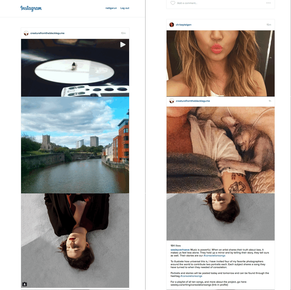
Instagram has always been a mobile-first platform, but lets face it: sometimes it’s just easier to look at photos on your desktop.
Unfortunately Instagram’s Web experience has always been a bit underwhelming. That might change soon thanks to an upcoming redesigned interface that emphasizes a cleaner, flatter, design:

For reference, this is what the legacy design looks like:

The new look is a clear upgreade more in line with modern flat design aesthetics than the bubbly gradients of the older design which looks more like it belongs in 2012.
While the new design shows fewer images in the same space, the large images and added whitespace helps each individual shot stand out more than they did in the old cacophony of images.
Once you click through an image, it also adopts infinite scrolling to make browsing through images much smoother – and much more akin to the mobile experience.

We’ve noticed the design only shows up in Safari, so if you’re not seeing the design yet, try switching up your browsers. The Verge notes the design is rolling out today and should be available for everyone by the end of the week.
from The Next Web http://feedproxy.google.com/~r/TheNextWeb/~3/eeOgLcAkrdQ/
via IFTTT

0 comments:
Post a Comment